An Insight on Alphasights
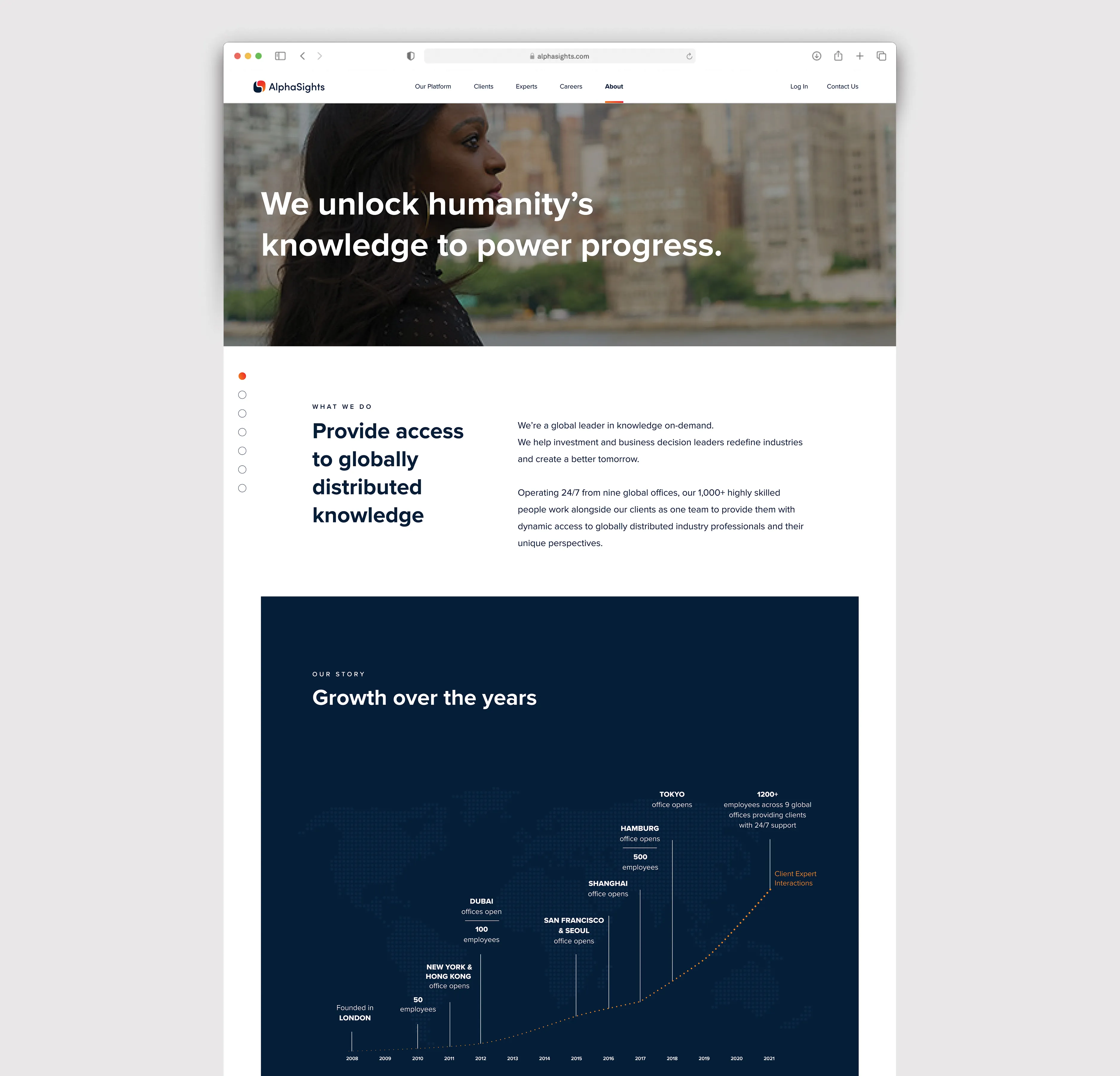
Alphasights is the global leader in knowledge on-demand that provides investment and business leaders with access to industry knowledge which drives better-informed decisions and delivers superior outcomes. They have approached us to redesign the user experience of the website, and create new artwork that will fit in with their new brand guidelines.

Our goal, to showcase the breadth of talent and reach a global consulting firm by combining human and artificial intelligence into the industry-leading knowledge-on-demand platform.
UX on Alphasights.com
The Problem:
Based on our stakeholder, user interviews, and analysis of the the performance and tracking on the current site, we have found the following takeaways:

Goals & Opportunities:
User journey and personas were conducted to break down the three main user type and look for touch points that will help achieve the following goals:

  • Push for more recognition on Alphasight’s different services and formats, which are call enhancements/add-ons, Insight projects, and Surveys.
  • Increase prospective client and experts visitors.
  • Clear and concise information throughout the site with easy to navigate call to action.

Solution:
The new sitemap was made easier to browse through all the categories. Each category is catered to the three specific user types; expects, prospective clients, and candidates. We also conducted a heuristic evaluation on our prototype and improved the features and functionalities such as some of the following:

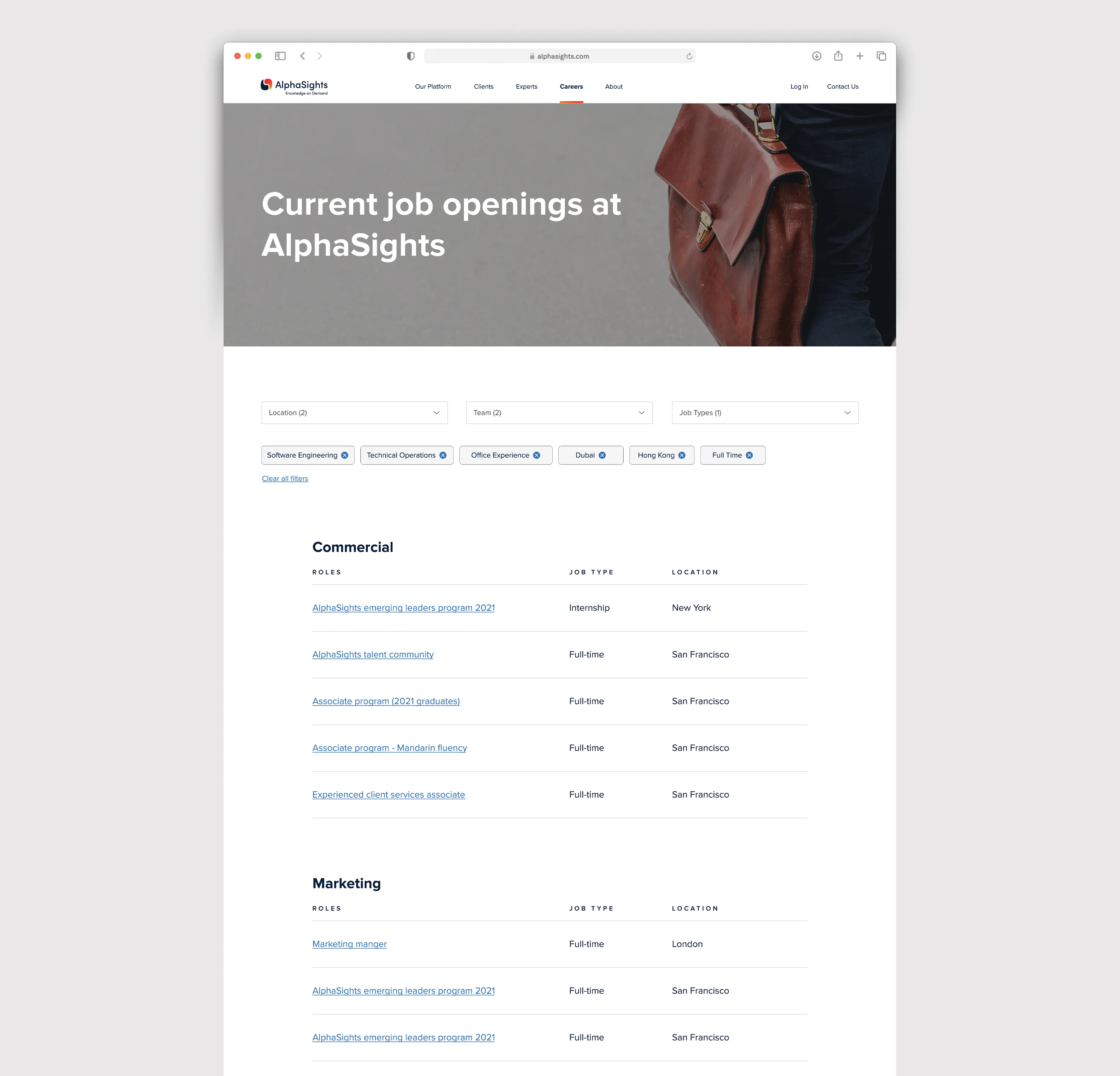
  • Candidates section - Clear understanding of what it’s like to work at Alphasights. Clear list of opportunities and easy to apply system directly on the website.
  • Expert section: Easy to access brief to connect them to the right clients to work with.
  • Client section - clear step by step tasks for users to know how it works and what’s next before they commit to signing up
Alphasights.com
The final site was a great success with improved click through rates to newer sections of the site, longer duration on site, more unique site visitors and more international visitors given the multilingual components to the website.
Website results since the launch:
Improved in page views
Improvement in Pages/ Session (Average Page Depth)

+ 68.62%

Improvement in new sessions

+8.33%

+ 83.71%

+8.95%

Improvement in Sessions
Visit Site ↗
My Role
Web Design, UI/UX, Mobile
UX Director
Kurtis Powers
Development
The Charles Group