Hello Rewards is a guest recognition and loyalty program by RLH Corp. (hospitality Corporation), to reward and knowingly recognize members with more perks and benefits. The client is looking to re-brand a memorable concept with a look and feel that resonates with guests. They would then like to revisit their existing Hello Rewards app to apply the new look while reviewing the usability and brand issues.

With the re-brand of Hello Rewards, the goal is to re-create a look that is more connected with RLH Corp. and reinforce their role as a link that brings all brands together. Surprise and delight are the core of the brand. Creating a bold, warm, and happy accent of colors and patterns creates that moment they are looking for. The color palette taps into the reds from RLH Corp. colors and the patterns constructed of interlocking elements convey the idea of synergy and of uniting multiple elements under a single vision.



- Confusing Flow:
○ 3 types of booking flow. Layers of nested navigation.
○ A mix of app navigation and hamburger menu. - Clutter:
○ Visually there are a variety of color, sizes, and shapes of elements.
○ The copy is redundant with too many instructional copies. - Brand Image is Lost:
○ A mix of elements, colors and treatments from Hello Rewards/RLH, and individual hotel brands


First, the app was only being used by 20% of hotel guests and there are 750,000 members but more than half of them is inactive since 2017. In addition, the app is averaging a low rating of 2 stars on the Apple app stores. Not only are the numbers low, but the lack of marketing and the brand being nearly unrecognizable are major issues as to why guests don't know about the membership. Hello Rewards' branding does not look anywhere close to the RLH corporation branding.

Guests are finding the following:
- 2 different ways to book a hotel.
- Too many buttons that don't take you anywhere, or duplicate pages.
- Inactive widgets and promotions. For example, guest's updates and upcoming stays are hard to find.
- You have to type the full hotel name and location in order to search.


- Organizing flow:
To create more clarity for members on where to navigate by clearing up all the unnecessary flow and sticking with one consistent path in order for them to find what they are looking for. - Clearing the Clutter:
To organize and clean up the app so the members have a consistent experience.
To pull only important information, eliminate repeats to not overwhelm users.
Create clearer visual cues to where they are in the app. - Brand Image is Lost:
Revisit the brand guidelines to follow the consistency of the style.
Eliminate and clear out unnecessary elements that are not a part of the brand guideline.

- Organizing flow:
○ Organize the flow of pages between the new and existing members by personalizing the home page. For example, creating a home page bypass and having default views on app load for members who have an upcoming booking. Members who are new or have no booking will see options on where to look.
○ Include icons on the home page to have access to the most relevant content. Each icon selections is to be relevant to a user type (new member/registered member).
○ Adding the search engine on the home page for both user types to allow members to continue to explore more booking options, special offers, or perks.
○ Create a seamless flow and continuous experience for members going from exploring to checking their upcoming stay, and to easily navigate during their stay. - Clearing the Clutter:
○ Choosing the right navigation first by eliminating the hamburger button with tray navigation or tabs for direct access to key areas. - Brand Image is Lost:
○ Use full-screen brand images to create a welcoming and dynamic environment with hotel images that appeal to members
○ Change out brand and hotel images quarterly to encourage members to keep checking for new updates.
○ Limit the brand colors to only primary colors throughout the app, and only allowing colors of Hotel brands when on the hotel section.

Home
The home screen acts as a dynamic dashboard, customized to a user type (new user, logged in, an upcoming trip, etc.). The full-screen brand image creates a warm and welcoming environment. Easy access to the member's profile and customized home screen depending on whether the user is a new member or current member with or without booking.

Booking
Members have easy access to search all RLH Corp. hotels before booking. They can search by destination, hotel or airport code.
Checking In
Members will continue to use the app during their stay with an easy way to navigate throughout the experience. They will use it for checking in, browsing information about the destination they're in, and have access to their room key with a digital lock.


Content
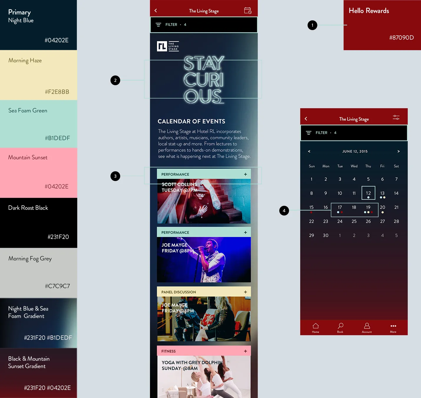
The introduction explains what The Living Stage is about. As Hotel RL is the only hotel on the app with this special feature, Hello Rewards wants to highlight this section that gives customers an opportunity to experience everything that Hotel RL has to offer. Users are dropped into a discovery section of the app that includes events for them to browse through.

Event Cards
The event card consists of the title, name of the event, time of the event, date, and event category.
Event Category:
Is made up of category title and identifying the color of the type of event.
Expand:
The “+” icon indicates that you can expand this card for more information about the event rather than opening up a new page
Bottom Sheet: Share Event:
A share pop-up will appear when clicking on the icon for options on where to share. The icons of the sharing platforms remain in colors for immediate familiarity. The event can be easily saved to their bookmark to come back to it later.
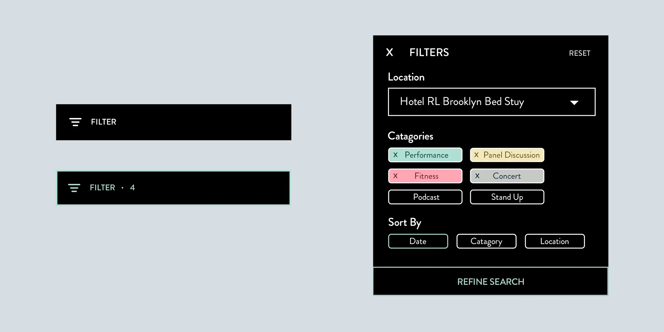
Input Chips:
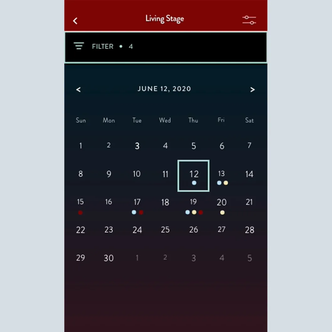
The top navigation filter option is a button that drops down. When the button is filled with a number, it indicates that the user has selected “x” amount of filters for the list.
Choice Chips:
The filter reveals all categories with customized Hotel RL colors to select and deselect. By default, chips are not colorized until selected. Chip is colorized with an X allowing to deselect back to the default.
Drop Down:
The drop-down menu by default will start on the location you have selected from the Hotel RL home page. When you drop down, you can select other locations or view all on the list.
The use of gradient background colors is a unique part of Hotel RL and sets itself apart from the other hotels as a more premium brand.Labeling of colors appears on the top of each card for it to be the first thing you see.4. Categories are color-coded in the calendar view as well for viewers to see overall.
